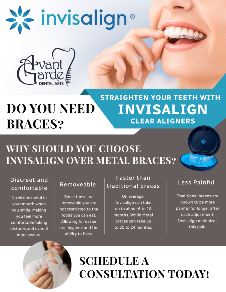
Flyer Design
The Challenge
The client asked for a flyer to highlight their Invisalign treatment and emphasize how it’s a better option than traditional metal braces, but they provided no additional details regarding text or specifics. Taking this as a prompt, I designed a visually appealing flyer that focused on the key benefits of Invisalign—discreetness, comfort, and flexibility—while clearly distinguishing it from metal braces. I included concise, persuasive messaging to engage potential clients, presenting Invisalign as a modern and effective solution. To ensure a clear next step, I incorporated a strong call to action, encouraging readers to schedule a consultation or learn more about the treatment. The flyer was designed to be both informative and visually striking, driving interest while remaining professional and approachable.
The Solution
After conducting some research, I identified the key advantages of Invisalign over metal braces, focusing on factors that would resonate most with potential clients. If I were a client, these were the reasons I would choose Invisalign: its discreet appearance, comfort, and flexibility. I highlighted each of these points with distinct colors to draw attention and create a visual flow that guided the reader’s eyes through the flyer for maximum readability. Additionally, I incorporated relevant images that reinforced the message and added visual appeal, ensuring the flyer was not only informative but also engaging. The final design was structured to make it easy for readers to understand the benefits of Invisalign at a glance, encouraging them to take action.